Power of design
RedCAT Systems | Jan, 2025
Read time: 3 minutes
Keywords: web design, graphic design, visual storytelling, people-centered, values, new year
The beginning of a new year is a time for many to hit the reset button. Us included.
RedCAT Systems superfans might have noticed in recent months that we’ve been tinkering with our color palette, logo, and overall digital identity. These breadcrumbs have been leading you to the big reveal of our brand new website today!
You’re probably thinking, “I literally went to www.redcatsystems.com–what are you calling ‘new’ and why?”
Let us explain.
People-centered approach
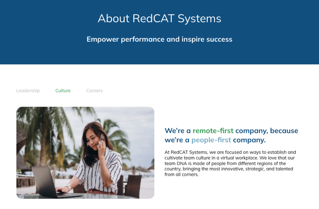
It’s true. We’ve been talking about it for years, but with the 2025 of it all, we’re showcasing our people-centered approach publicly. It’s important that you understand who you’re connecting with when you contact RedCAT. We have plenty of personality and now we have the website to match.
You can now learn more about us through, well, the About section. Our design team created these pages in line with the core values of transparency, consistency, simplicity, and curiosity. Through these pages you can get the inside scoop on the leadership team, people programs, and a map of the continental United States that highlights our remote-first way of work.
Customized look
We’re proud that our products provide our customers the opportunity for customization. They have the flexibility to align product user interfaces (UIs) with their company brand toolkit and naming conventions. It only makes sense that we got a little more customized in choosing our own color palette.
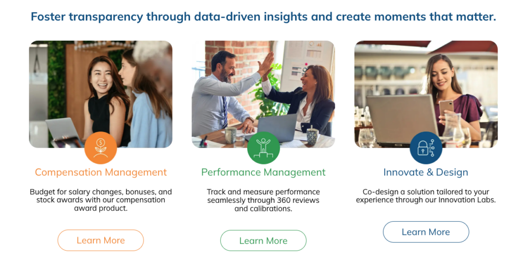
You’ll notice that we’ve moved away from the red and black of yesteryear to a more vibrant experience. This new design is all about blue and green, with a touch of orange. Our visual designer, Gabe Gatchalian, spent time choosing colors that match the vision RedCAT is developing for the coming years.
From his research and experience, he found that blue hues are often associated with feelings of serenity, trust, and security. When it comes to the green hues, they provide growth and abundance. Then, that hint of orange brings motivation and adventure.
Sounds a lot like the RedCAT of today and the future to us.
Applicable product information
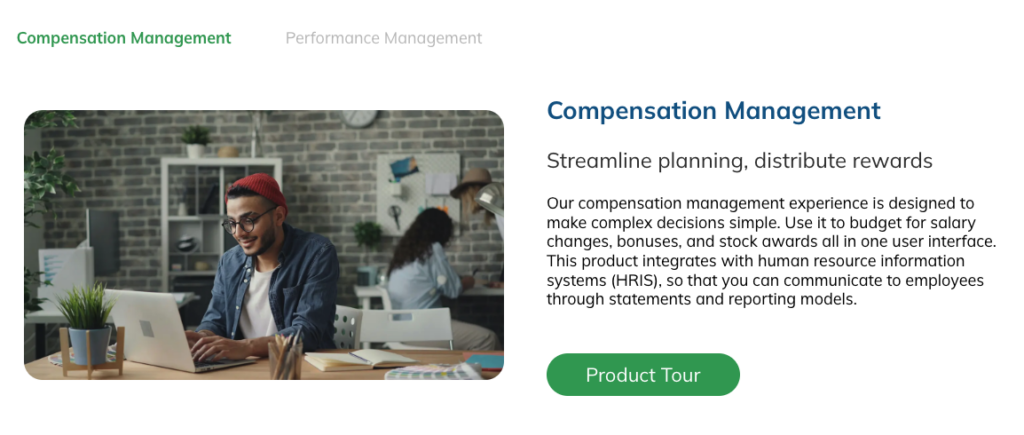
Life is confusing as it is, so we’re keeping the product information simple. We want you to have the information necessary to make business decisions with your team. The platform product pages are easy to navigate and provide you applicable information about how our solutions align with your organization.
And spoiler alert, we’re reimagining the product tour videos to better capture how we can support you during performance review cycles as well.
Now that you can access what our design team can do with a website, wait until you see what we can do with our platform of products.
Happy New Year! We cannot wait to show you what else we have planned for 2025.


